Colour by Nature
Farrow and Ball have collaborated with the Natural History Museum on a range of new colours bringing 16 new hues to the palette, these are an extension to their carefully curated colour card. Both Anna and I are really excited about this partnership; Farrow and Ball and one of our all-time favourite museums is a definite ‘WOW’. If you’ve never been to The Natural History Museum you really need to plan a visit. It’s a great place to go and inspire your inner explorer. You will find dinosaurs, dodos, whales and many more fascinating creatures inside each of the museum’s free galleries. There are six to explore, plus the Rothschild room which tells the story of one man’s passion that created the Museum. www.nhm.ac.uk
Every one of the sixteen new hues have been inspired by the wondrous Werner’s Nomenclature of Colours an 1814 classification of colour in nature. Farrow and Ball’s Colour by Nature isn’t just a celebration of colour, but of the shared respect and curiosity for the natural world, each of these shades has been meticulously researched to bring together a collection of the true colours of nature into your home.
Werner’s Nomenclature of Colours first published in 1814, is a taxonomic guide to the colours of the natural world which has been cherished by artists and scientists alike for more than two centuries. Werner’s Nomenclature of Colours is a charming artefact from the golden age of natural history and global exploration.
You can see a wonderful digital version of the book here: https://www.c82.net/werner/
In the late eighteenth century, mineralogist Abraham Gottlob Werner devised a standardised colour scheme that allowed him to describe even the subtlest of chromatic differences with consistent terminology. His scheme was then adapted by an Edinburgh flower painter, Patrick Syme, who used the actual minerals described by Werner to create the colour charts in the book, enhancing them with examples from flora and fauna.
In the pre-photographic age, almost all visual details had to be captured via the written word, and scientific observers could not afford ambiguity in their descriptions. Werner’s handbook became an invaluable resource for naturalists and anthropologists, including Charles Darwin, who used it to identify colours in nature during his seminal voyage on the HMS Beagle. Werner’s terminology lent both precision and lyricism to Darwin’s pioneering writings, enabling his readers to envision a world they would never see.
 This new edition brings the classic work back to life.
If you’re as fascinated by this as we are, you can buy a copy of Werner’s Nomenclature of Colours: Adapted to Zoology, Botany, Chemistry, Mineralogy, Anatomy, and the Arts at Amazon.
No.W1 SNOW WHITE
A fresh, delicate white
Snow White is a wonderful alternative to a pure white, versatile enough to be used on woodwork and ceilings alongside any other colour. A tiny hint of yellow pigment is the secret to its warm and reflective nature, bouncing light around in even the darkest of spaces and creating rooms with a laid-back feel.
No.W5 ORANGE COLOURED WHITE
A warm cream with a hint of orange
Orange Coloured White is a fresh yet warm cream particularly suited to north-facing spaces. The addition of the merest amount of red pigment to this earth-based neutral adds a delicate luminosity without feeling too creamy, creating delightfully warm rooms that appear to glow.
No.W7 SKIMMED MILK WHITE
A mid-tone off white
Skimmed Milk White is a mid-tone off white with extraordinary softness. Its laid-back nature creates rooms that feel as if they have been that colour forever, whether used on woodwork alongside a stronger wall colour, or on walls with a Snow White trim for a more contemporary feel.
No.W9 ASH GREY
A relaxed green-grey
Ash Grey has a relaxed feel that makes it suited to any space, particularly when combined with the slightly warmer Skimmed Milk White on woodwork. For a more modern look, try teaming with a lighter Snow White trim. The underlying green in this shade means that it will appear more intensely coloured in natural daylight and greyer in areas of low light.
A quiet dark stone
Broccoli Brown is a quiet dark stone colour that sits effortlessly alongside natural materials such as weathered wood or flagstone floors. Its muted quality makes it ideally suited to studies, where its reserved tone serves as the ideal backdrop, especially when taken over the ceiling as well as the walls.
No.W29 ULTRA MARINE BLUE
A romantic mid-toned blue
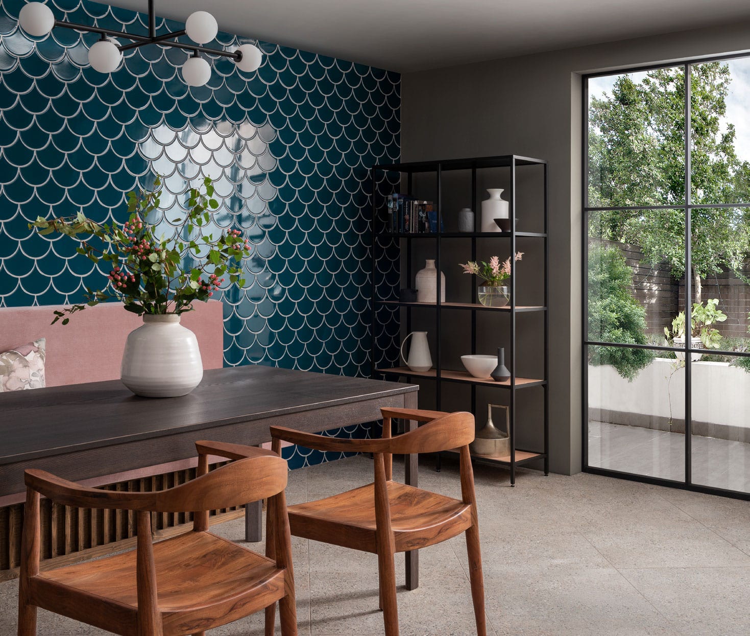
A stunning blue with a slightly romantic feel, Ultra Marine Blue has been in favour since the 18th century, when it was often used to make small rooms feel bigger. For the contemporary home, it looks striking on cabinetry, especially combined with a kitchen island in dramatic Scotch Blue.
No.W40 IMPERIAL PURPLE
A rich deep purple
Deep Imperial Purple transforms dining rooms and other intimate spaces, creating a luxurious look and enveloping feel. Used in smaller quantities, such as inside a bookcase, it can add a rich pocket of colour to even the most neutral of rooms – try it with soft Snow White and Ash Grey for a relaxed scheme with a playful touch.
No.W24 SCOTCH BLUE
A deep, intense blue
This intensely pigmented blue brings a smart look and luxurious atmosphere to any room, especially those designed for entertaining. Particularly eye-catching when combined with Ash Grey woodwork, Scotch Blue creates inviting spaces that you can’t wait to escape to at the end of the day.
No.W53 EMERALD GREEN
A bright, uncomplicated green
Emerald Green is easy to use in all sorts of homes, creating rooms with an upbeat yet elegant atmosphere. This beautiful jewel tone makes an excellent addition to strong multi-coloured schemes, especially alongside Lake Red and Ultra Marine Blue, where it strikes a balance between being vibrant and soothing.
No.W50 VERDIGRIS GREEN
An elegant copper green
While happy and lively on first glance, Verdigris Green retains a reassuring feel and underlying elegance when used in the home. A rich blend of pigments allows it to feel more vibrant when teamed with lighter tones, and it takes on added vitality when combined with Dutch Orange or Lake Red.
No.W56 SAP GREEN
A true earthy green
This organic green is a true reflection of nature, creating a soft, lived-in atmosphere when combined with Broccoli Brown and Duck Green. Used in smaller spaces, such as a hallway or porch, it creates a richer, more vital atmosphere.
No.W55 DUCK GREEN
A smart deep green
Named after the deep green plumage of a mallard, Duck Green is a wonderful reminder of the exquisite colours of nature. Strong but subdued, it offers a contemporary alternative to charcoal shades for modern homes and makes a warm and welcoming pair with Deep Reddish Brown on woodwork.
No.W76 DUTCH ORANGE
A clean bright orange
Dutch Orange is a clean bright orange with the ability to enliven any space. With a dynamic quality that brings an enveloping warmth to rooms, it feels lively combined with Verdigris Green and Skimmed Milk White, and looks particularly stunning with a Duck Green trim.
No.W92 LAKE RED
An adventurous cool red
This adventurous colour appears red to some and pink to others but always feels happy and vital. Fantastic in small spaces, Lake Red feels dynamic and energising used across walls, woodwork and ceilings, and works wonderfully inside cupboards.
No.W93 CRIMSON RED
A deep, warm pink
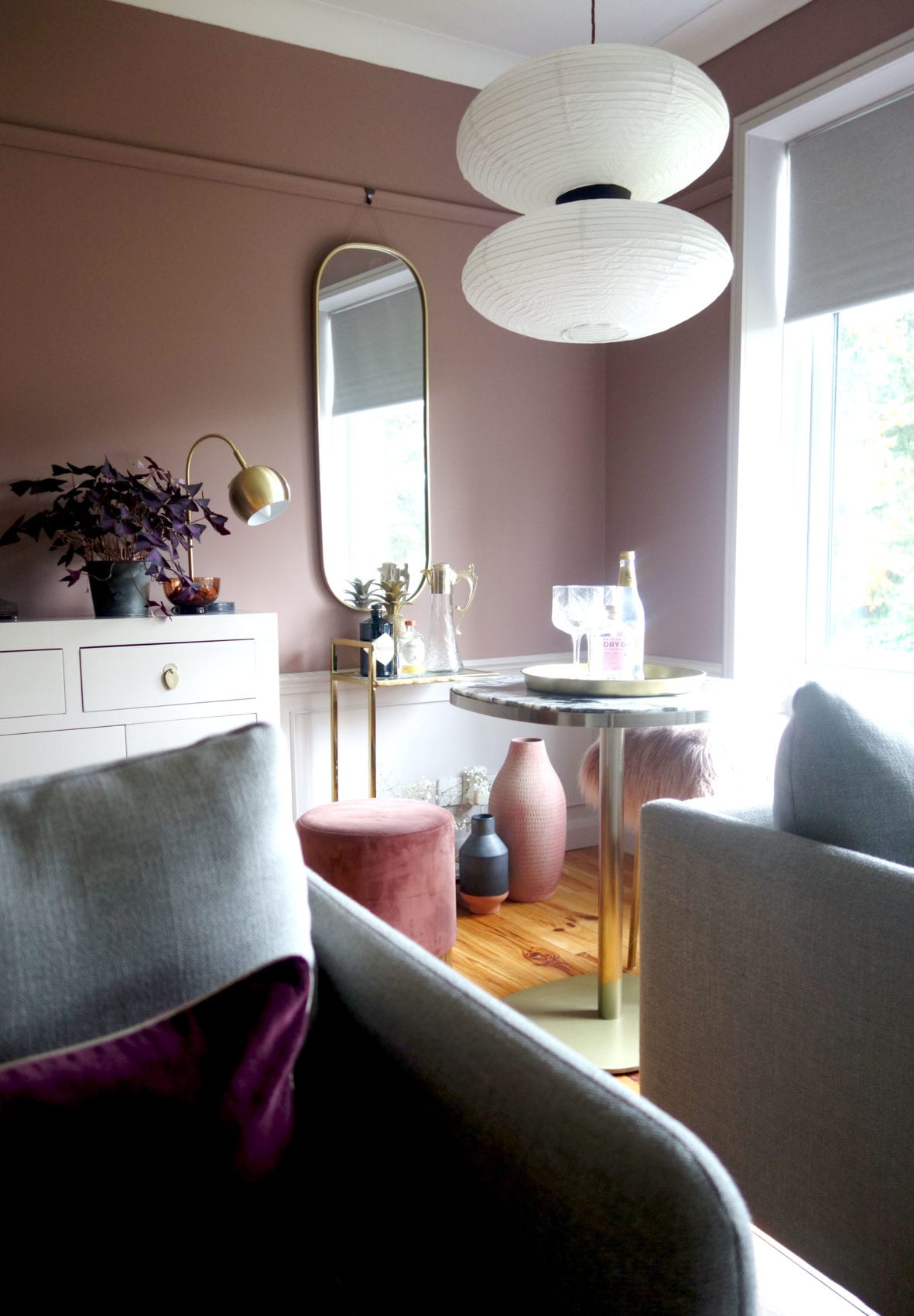
This deep, warm pink creates spaces that feel soft and inviting, especially when teamed with Skimmed Milk White on woodwork. Paired with dark tones, however, Crimson Red takes on a glamorous feel, with Scotch Blue, in particular, bringing out its rich and romantic nature.
No.W101 DEEP REDDISH BROWN
A deep, earthy brown
Deep, warm and welcoming, this shade was once popular in country houses, where it was often used to highlight the woodwork of back stairs. In a contemporary setting, it still makes a wonderful colour for walls, doors and trims alike, adding richness and drama to any space.
Launch day in Chelsea
We went along to meet with the F&B team on launch day at their Chelsea store. F&B shops are always beautiful, and today they had the very talented Julianna Byrne creating a mural with the new colours.


 We also met with the Georgia Spray, the owner of Partner Editions who’s mission is to make remarkable art affordable to the masses. F&B has been working with Georgia to arrange the mural collaboration at their two London stores.
Sally’s favourites
As soon as the new colour card arrived I was drawn to three of the colours, my eyes kept going back to them and then after researching the background of each colour I have fallen even more in love. I mean who doesn’t adore the golden crested wren or the Neck of a Mallard and the underside of an Orange-tip butterfly. Straight away I felt the need to dig out my binoculars and go off exploring and all I could think of was those three famous ducks on the wall of Hilda and Stans living room. These colours provoke your imagination and give you the urge to feed your mind with the colours of nature. So set yourself up for a day of exploring your local park or nature reserve for colour inspiration.
Anna’s favourites
For me, Scotch Blue talks my boyish side. As a young girl, I never liked stereotypical girl colours and deep blues and navies were my go-to. It’s deep and moody – probably just like me as an early teen.
To counteract all that moody atmosphere, I think I’d also pick Crimson Red for the Anna of today; embracing the girlie side complete with pink lounge and an excessively colourful wardrobe.


