Lounge Revamp Project – Coming into the light
About 3 years ago I took the decision to embrace the dark side and painted my lounge walls in Downpipe by Farrow and Ball. I mixed it up with my colourful mid-century inspired style and I really enjoyed the effect. In the last year or so I’ve been thinking about a change. As much as I still love downpipe, I feel it’s not giving me the canvas for the styles I’d like to now experiment with. So, I’m coming over to the light side. That isn’t to say I’ll be painting my walls white (well I’m probably have to a couple of times initially to kill off the dark before applying any other colour) I’m going for a palette I’ve been dreaming up throughout my love affair with pinks and autumnal hues.
Some of my lounge inspiration:
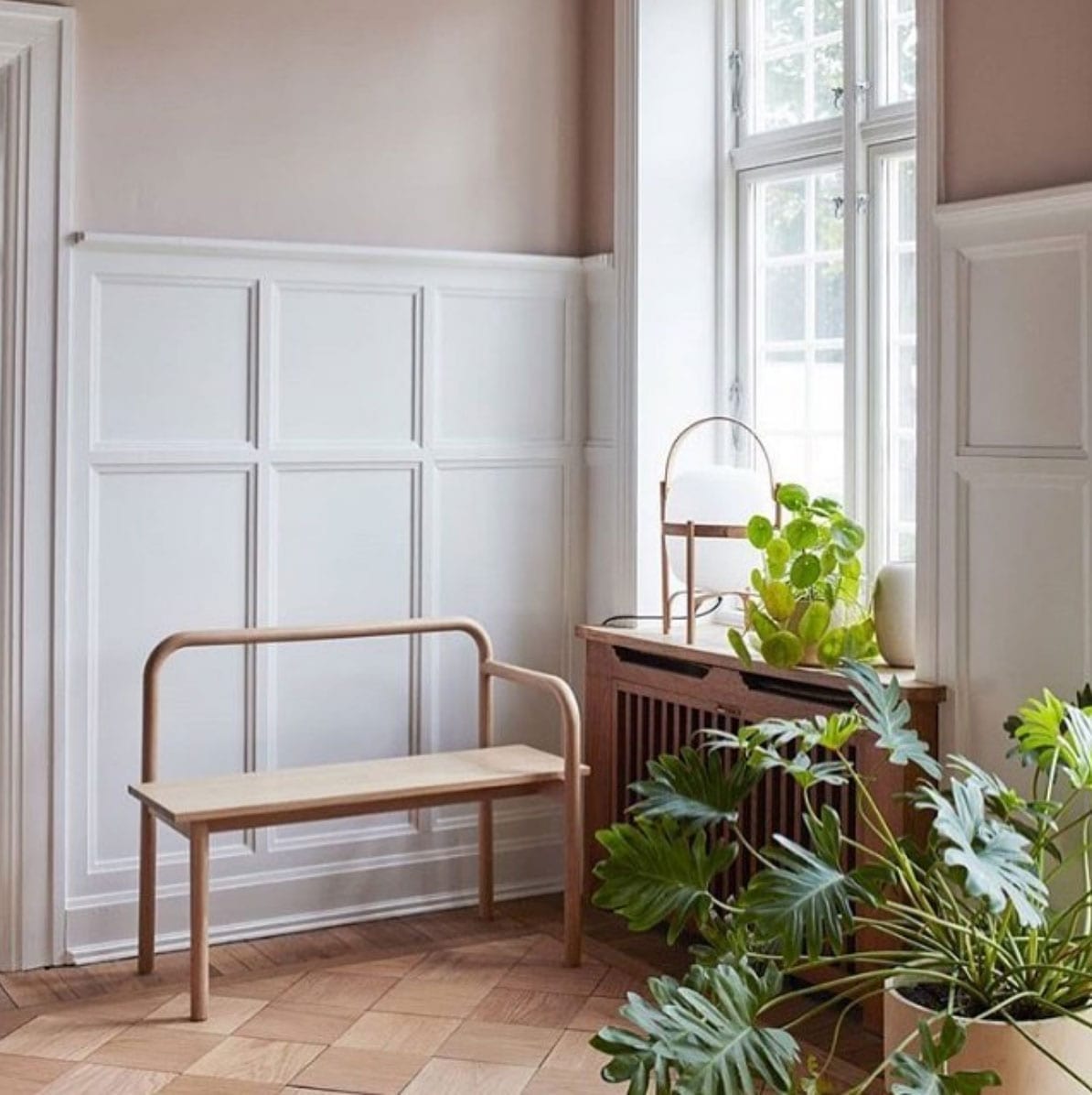
Pic via ElleDecoration DK
Love the panelling and how it splits the wall in to two sections.
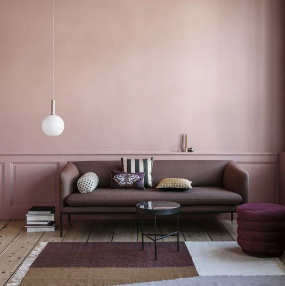
Pic by Ferm Living
Such a great colour and I love how it covers the panelling too.
In terms of paint I’m totally sold on Farrow and Ball paints. I love the chalky effect you get in natural light and the great coverage I think I’ll need over the Downpipe. We took a trip to the Farrow & Ball factory a short while ago and we saw the great quality in care that’s taken in making every batch. Plus all their paint is water based which makes life so much easier as well as having less environmental impacts which is really important to me too.
The colours I’ve chosen are part of a palette suggested by the Farrow & Ball colour alchemists. With the new Sulking Room pink as by core, I’ll be using Pigeon Grey and Charlston Grey to offer balance as well and tying in the brown tones from my flooring and also potentially to husband’s controversial chair (yet to be decided whether it stays or goes).
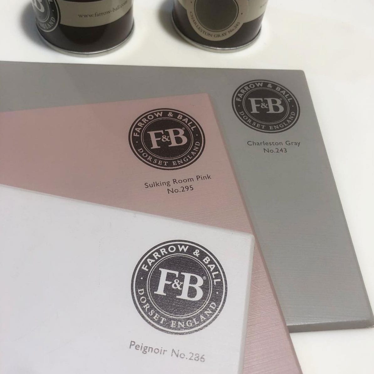
My planned colour palette.
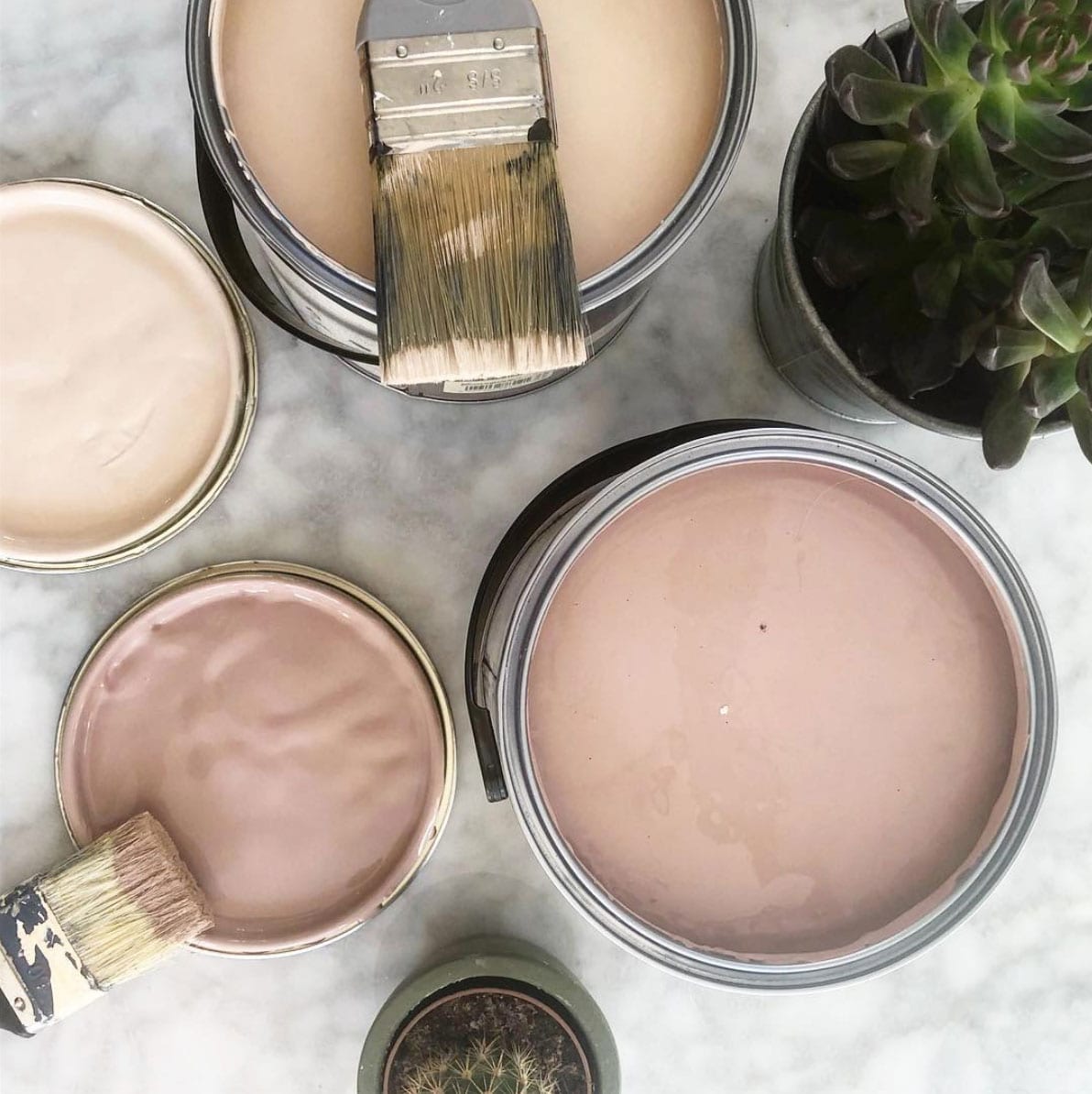
I’m also going to treat the walls to some faux panelling. Our lounge is rather large and as much as I’m not complaining about that, the shape and non-symmetry does make it a challenge to style without lining all the walls with furniture. I like to pull furniture away from the walls and create spaces around key features such as the fire place (not the television) and also a little reading area I’d like to create. The panelling with give the walls that extra something without needed to be dressed with pictures and mirrors, which is always the temptation, but I’d like to just enjoy the colours and the simplicity.
For the lighting, I’m working with two ceiling lights that aren’t really where I want them, so I’m going to have two extra-long flex light fittings that loop off the ceiling and hang where I want them. I’m having two Saturn shaped paper lanterns (totally inspired by the designer ones I love but don’t have budget for!) in white to stand out from the walls. I have a few floor and table lamps which I use in the evenings, so really the ceiling lights are more of a feature and for use when reading etc.
Work starts next week and I’ve got a few items arriving this weekend, including a sideboard by Nine Schools. Very exciting! Also I need to pick some arm chairs, these one pictured are by DFS but I also have my eye on some from West Elm. Legs must be metal to match my existing sofa. My rug by Nordic Knots and my coffee table from Habitat are both definitely staying.
Let me know what you think! Any comments of suggestions gratefully received.


