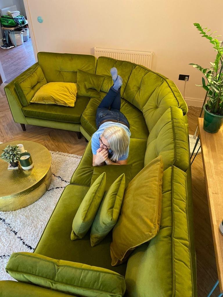
Go bold with colour
The days of being subtle and muted are over, on such a miserable rainy day we’re welcoming in the bright and fun colours that we’re beginning to see online and in stores. Bright velvet sofas, bold colour blocking and highly saturated accessories are all part of the colour revolution that we’re embracing in our homes.
Towards the end of last year I swapped out my deep yellow and monotone accessories for bold and bright pinks, punchy yellows and the odd flash of green too. As the winter months set in I felt I needed to bring the brightness into my home. In SS18 we’re looking to see this continue, but with a fresh spring flourish.
 When we visit London last week on our tour of the flagship stores we definitely found that the colour was back. These fab bright and bold sofas where in Heals and they look just wonderful together. What is it they say about blue and green – well whatever it was forget it, because we love it!
It carries on through accessories too. We saw load of beautiful and colour glassware and stone ware, including these lovely displays.
We’re loving the bold blocks of colour people are applying to their walls. You don’t need to paint a whole wall anymore, a splash of colour can make a massive difference to your home. We love this room below, features in Living Etc this month. Such a wonderful, friendly and fun space! It’s inspired by artist, David Hockney. If you check out his work you can totally see how!
We’re using colour in a completely different way too. That pop of colour added by an accessory or item of furniture is the new way to do it – don’t worry about painting a feature wall or buying a new sofa. We love this concept as you can so quickly change your palette to suit the season or just your latest fad!
You can keep your colour scheme broad or select just a few colours that work for you. We love this shot below. Dark blue curtains are the perfect contract to the punchy orange sofa and bright yellow chairs. Perfectly blended by the artwork and accessories.
Your background colour is important too. To balance the colour you might need something more neutral like black, white or grey. A dark colour will accentuate your colour palette so well. We love this shot from Abigail Ahern’s blog.
Finally another from Living Etc magazine.


