If you were lucky enough to be born with a natural flare for design and space, then you are very lucky! You probably just place things and they feel right. You naturally know what items go together and which don’t. The rest of us have to learn these tricks. Most of it is instinct, and that’s the trait of a creative person I guess.
What about me? I like to think that I’m creative, but I know there are a lot of people more creative than me! In my day job for example (I’m not sure if I’ve ever mentioned it before) but I co-run a design agency. We hire creative people to do what they do best, I do not design. I know what I like and I can generally describe it, but maybe couldn’t achieve it myself without some guidelines, rules or inspiration to follow. With Green&Mustard and my own interior endeavours, I rely on inspiration from Pinterest, Instagram and the wider internet to see exactly what I like before I recreate it in my own way. Sally on the other hand, has a very natural flare for styling and comes up with new and very unique concepts from scratch – I’m very jealous ?.
So, how do the rest of us learn how to do it? Well there are some basic rules that I find help and try to follow:
1. Give it some space!!
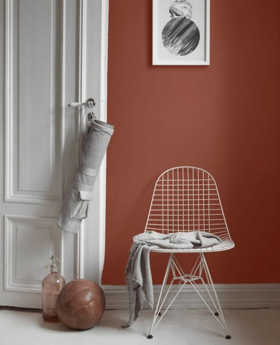
Overcrowding, too much clutter and too many things shouting for your attention at once does not make for good design. Ever heard of the two thirds rule? It’s a basic principle that, when applied to design, mean you can occupy the two thirds but should leave the final third free. It works! Use it for placement of artwork on walls, positioning of furniture and much more…
(via Design Milk)
1. Style in odd numbers
It’s an old trick from floristry, but applies on a wider basis too. Group items in odd numbers, it add more interest for the eye and allows them to cluster together more effectively without grouping visually.
(german pottery via Pinterest. Cactus vases from Conran Shop).
2. Have a focal point
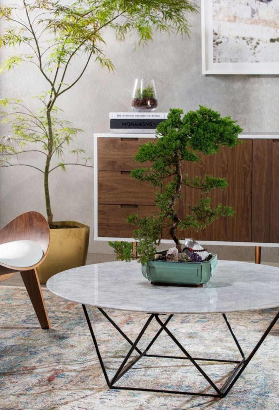
And please don’t let it be the TV! ? a focal point can be a fireplace, feature wall or artwork, a coffee table with styles items on top, a collections of items or ever a window. Having too many (more than one) focal point does not work – it’s just makes them compete and neither will win!
Abigail Ahern is the queen of creating interest and focus points. She does this with colour and light and we love this fireplace shot!
This beautiful garden room creates a focus point with placement of furniture. You’re eye is drawn into the centre point of the chairs and the light fitting helps too!
3. Lighting
Lighting is so important! If you light everything equally you can lost the effect of a focal point. Table lamps and floor lights bring the light lower into the room and highlight objects and areas that might not be the focus in daylight.
If you use a centre ceiling light, give it some impact. A shade on a bulb says something about your style – finish the job and get something intentional and considered.
4. Be considered with colour
How do you want your room to feel? Relaxing? Inspiring? Invigorating? I’m sure all these words link to particular colours in your mind, so let your instinct guide you. Try not to be too faddy. Everyone likes a follow trends, but can you style them in rather than fix them? I.e. Wallpapering and painting is more permanent and labour intensive/costly than changing the cushions on your sofa. Read our blog entry about how to reinvent your room rather than redecorating for tips on this.
That’s my top five, I’m sure there are not! Feel free to suggest your tips in the comments below.
Thanks for reading 🙂


