We’ve been busy planning a new extension project for a client and we thought it was about time we shared some ideas with you all! Meet Bianca, a lady of many talents and commitments! Environmental warrior, mum of two and wife to an America’s Cup crew member, this lady didn’t have time to interior design their new house extension, so she approached us to do it for her. Bianca runs a charity called ‘Final Straw Solent’ an organisation focused on reducing the number of single-use plastics that make their way into our seas and oceans. Bianca recently won ‘The News’ local heroes award for her work and we’re very proud of her!
The plan was for an L shape extension that wrapped around the back of their existing house and would significantly enlarge the living areas of their home. There are also plans for an office space where Bianca and her husband could hide away and get some work done.
The green section on the plans below shows the new space added onto the existing house. The general feel is open plan, but with a supporting, feature wall in the middle creating two separate zones for relaxing and dining.
Bianca wanted to theme the house to fit with its woodland setting. The extension was to have a full glass back which looks over the woods behind their house and skylights looking up into the trees.
 We got to work on planning colours and layouts and presenting these initial concepts to Bianca.
Lounge Area
The joining wall between the lounge and the dining space would have a feature log burner, bringing the rooms together and allowing the burner to heat both rooms. To create even more of a feature of the space, we chose Burt and May’s Green Cubist tile for the fire recess walls. The tiles are fireproof with lovely vibrant colour and natural texture.
Side sides of the fireplace wall would feature a wall mural, linking with the woodland surroundings. We chose Woodchip & Magnolia’s Zepher mural. The W&M team worked with us to customise the design to fit the space; fantastic service that made using the mural possible!
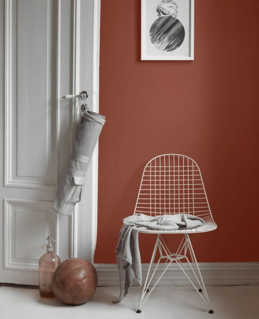
The opposite wall in the lounge would have a beautiful warming colour. We chose Farrow & Ball Setting Plaster for its chalky finish and light-changing tendencies in a north-facing space.
Flooring
Throughout we’ve suggested an oak herringbone effect to zone the lounge and dining spaces, with polished concrete by the patio doors and out to the patio itself, removing the borders from the space and allowing it to extend outside the glass doors. In the summer with the doors open, the garden would feel like part of the lounge. Concrete is also very practical with children and dogs and easily cleaned.
For the sofa, we chose an Ikea sofa in soft green to pick up colours from the mural and also to bled the green in from outside. Accessories such as the coffee table were from Habitat.
Dining Room
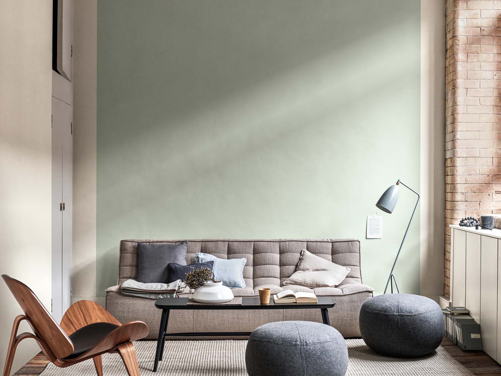
In the dining room, we chose ‘Mouse Back’, another Farrow and Ball colour to give a neural feel against the Setting Plaster. Feature lighting in the accent colours would hang above the dining table and a credenza from Swoon would add some glam and sparkle in the corner.
Accessories

 The details are so important! We’ve picked vintage style light switches from Swtch UK and a retro desk for the office from La Redoute.
We’re really looking forward to seeing this project come together in a few weeks time! Watch this space.


